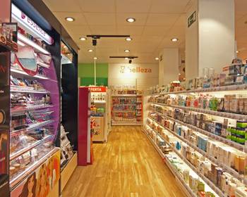
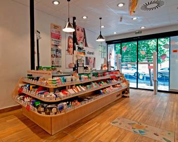
Cefla is the chosen partner for the restyling process of the Spanish Group DIA’s brand Clarel.
A new format was created for the brand Clarel in 2017. It stands apart from the previous one for the wider assortment and a sales surface area that covers over 230 m2. Even previously existing stores were adapted consistently with the new image designed by Cefla. The goal was to boost profitability by improving the shopping experience of habitual consumers and by encouraging brand knowledge in new clients.
We implemented a new layout to improve space management and streamline the flow of clients. We also performed a project design study on communication and graphics entailing the addition of decorative elements to characterise the departments with different colours that make it easy to find them, besides enlivening the point of sale.
The outcome met the expectations of the client DIA. Indeed, the restyling process has generated an increase in mean billing, and new clients have been acquired. Moreover, considering the success of Clarel’s new format, the Group has decided to implement it also in the supermarkets La Plaza 3 de DIA furnished by us to win the brand a higher market position.


