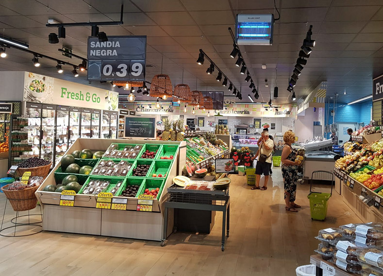
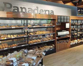
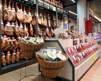
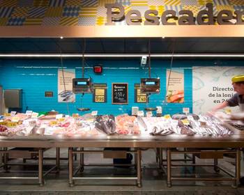
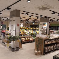
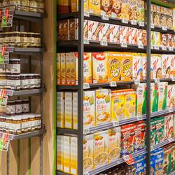
The project of the "La Plaza de Dia" store in Alcalá de Henares, a small town on the outskirts of Madrid, started with this customer's request to have the existing format restyled - with the aim of making it more attractive and improving sales results.
Cefla Shopfitting was chosen as the preferred partner for the first store of the new format, named "Dia La Plaza 3", thanks to the new concept designed by our Retail Design specialist team, focussing on material and finishing research and in line with the brand identity of the Spanish brand Dia, which targets the high quality proximity market with a wide range of products.
In designing the layout, an important space was reserved for the entrance area where, in order to increase the perception of availability of valuable products, fresh produce are stored, displayed in a carefully arranged setting and enhanced by cleverly studied lighting. The shelving heights in the central part of the store have been lowered, in order to enhance the focus on the brand's private label with clear communication, for the purpose of boosting consumer spending.
Another feature of the new format is the integration of Clarel, Dia's concept created for customers looking for health&beauty products. By combining the two formats, the store's offering has expanded and now includes more services for its customers; the customer perception of the store has thus evolved from "low cost" to high profile, resulting in excellent sale figures thanks to a large turnout.

