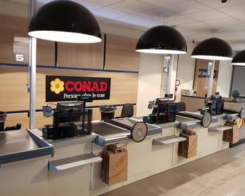
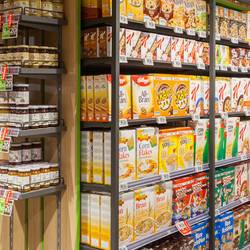
Retail outlet format was developed througn a Retail Design project.
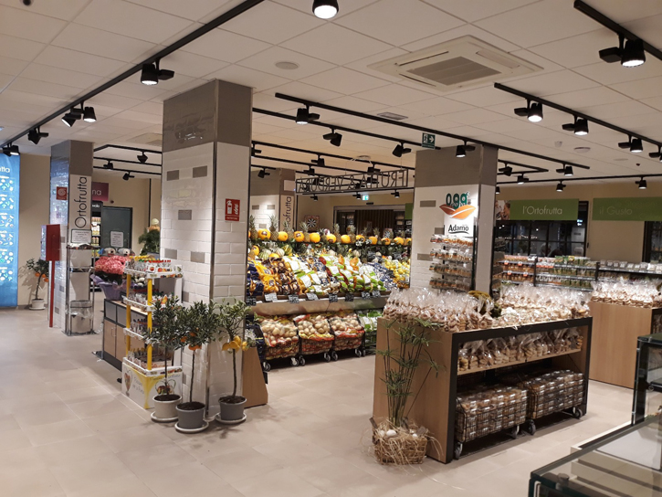
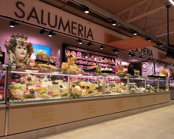
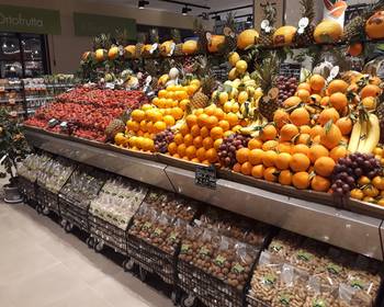
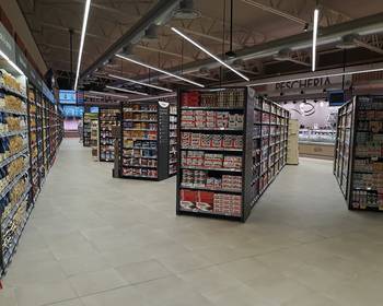
Following specific analysis of the materials, coverings and flooring, it was possible to differentiate the different departments and make the sales environment welcoming. Wooden and steel tables as well as 3x3 structures were used in the fresh food section to display goods; the walls behind the grocery section are fitted with panels or tiled.
Wood or metal overhead furnishings have been used to distinguish the retail outlet, installed in certain store areas, for example in the wine section and the organic food section. Graphics differentiate the different departments and have been created in line with Conad’s corporate identity.
Cefla Shopfitting also dealt with the interior lighting analysis, aimed at highlighting the retail outlet and improving the shopping experience.
Attention to detail and use of products which can be customised and as versatile as the 3x3 shelving has enabled us to create a store which stands out for its warm and welcoming style.
